Tupperware
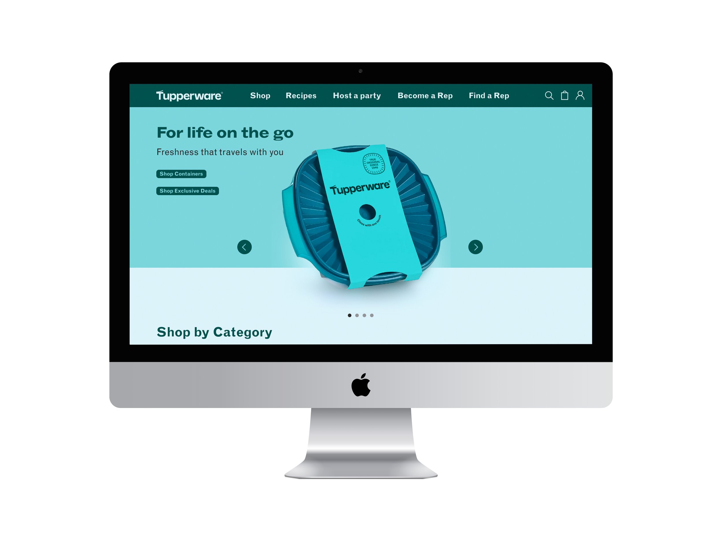
I took an Applied User Interface (UI) Design and Digital Accessibility course at MCAD to deepen my knowledge of UI design and learn how to use Figma. During the 6-week course, we had the opportunity to redesign a website for one of our favorite brands to improve its existing design.
I chose Tupperware® for my project because it's a well-established brand with comprehensive guidelines. Its clean photography, typography, and vibrant color palette provided a strong foundation for creating an engaging website.
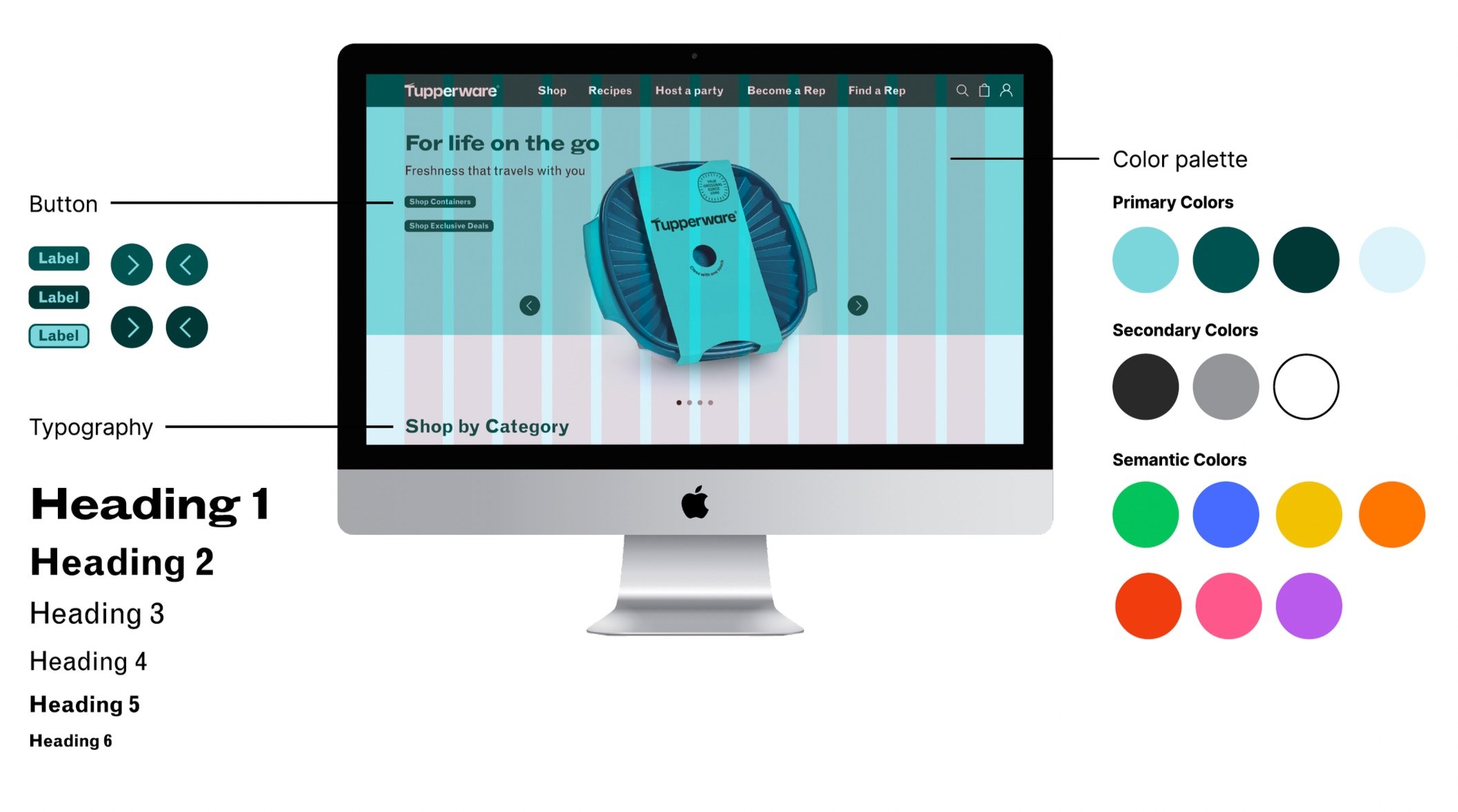
Throughout the process, I gained valuable experience in designing for accessibility, improving the user journey to checkout, and creating reusable components in Figma. After evaluating the existing Tupperware website (tupperware.com), I identified several areas where the brand guidelines could be better leveraged to improve the user experience. This included streamlining the purchase path, reducing clutter, and addressing inconsistencies. Below, you'll find a look at my design process and the final result.
Requirements on Project
Follow WCAG 2.1 AA guidelines
Design a 3-5 step flow
Build a component library
Create an interactive prototype


